Selector
We know that @Component decorator functions take object, and this object contains a lot of properties. So in this article we will learn about Selector properties which is Inherited from Directive decorator .
The selector attribute allows us to define how Angular is identified when the component is used in HTML.It tell Angular to create and insert an instance of this component where it finds the selector tag in the Parent HTML file in your angular app.
The selector accepts a string value, which is the CSS selector that Angular will use to identify the element. We will use it in html to place this component where we want. If you see the index.html file, you will find <app-root></app-root> component inside the body.
The component selector is a CSS selector that identifies how Angular finds this particular component in any HTML page. In general, we use element selectors <app-root></app-root> ), but it can be any CSS selector, from a CSS class to an attribute as well.
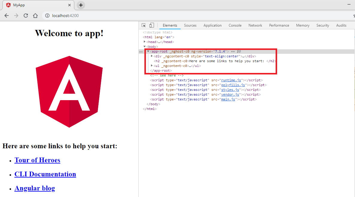
The component is applied to the <app-root></app-root> tag in index.html. If index.html does not have that tag, Angular will fail at startup. You can check where the angular application will be played.
Note that it has a prefix with the app, which is added by the Angular CLI by default, unless otherwise specified.
The recommended practice when creating new components is to use element selectors (as we did with 'app-root'), but technically any other selector can be used.
You can make the selector as simple or complex as you want, but as a general rule, try to limit yourself to simple element selectors unless you have a very strong reason for not doing so.
The basic component only needs a selector (to tell Angular how to find the instances of the component being used) and a template (which Angular should render when it finds the element). All other attributes in the component decorator are optional. In the previous example, we defined that the AppComponent will be rendered whenever Angular finds the app-root selector and that the app.component.html file is displayed when it finds the item.
For example, here are some ways you can specify the selector attribute and how to use it in HTML
- element-name: Select by element name.
- .class: Select by class name.
- [attribute]: Select by attribute name.
element-name: Select by element name
selector: "app-root" would result in the use of the component as <app-root></app-root> in the HTML code.
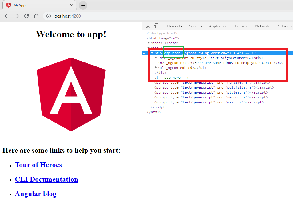
Here we will create a new project. The new project is created with a component, our root component called AppComponent and has an app-root selector as shown below
app.component.ts
import { Component } from '@angular/core';

@Component({
  selector: 'app-root', // see here
  templateUrl: './app.component.html',
  styleUrls: ['./app.component.css']
})
export class AppComponent {
  title = 'app';
}
In the previous code 'app-root' there is a selector that tells Angular to create and insert the component instance. It replaces the content of the component in the tag <app-root></app-root> that is present in the main HTML in our case is index.html.
selector: 'app-root':
Selector means that we call or render this component in HTML with <app-root></app-root> name.
This is the name of the tag to which the component is applied. For example: <app-root></app-root> within index.html.
And the app-root component has been added to our index.html file which is you can see under index.html as shown below
index.html
<!doctype html>
<html lang="en">
<head>
  <meta charset="utf-8">
  <title>MyApp</title>
  <base href="/">

  <meta name="viewport" content="width=device-width, initial-scale=1">
  <link rel="icon" type="image/x-icon" href="favicon.ico">
</head>
<body>
  <app-root></app-root>
</body>
</html>
When we run our app you will show output as shown below
.class: Select by class name
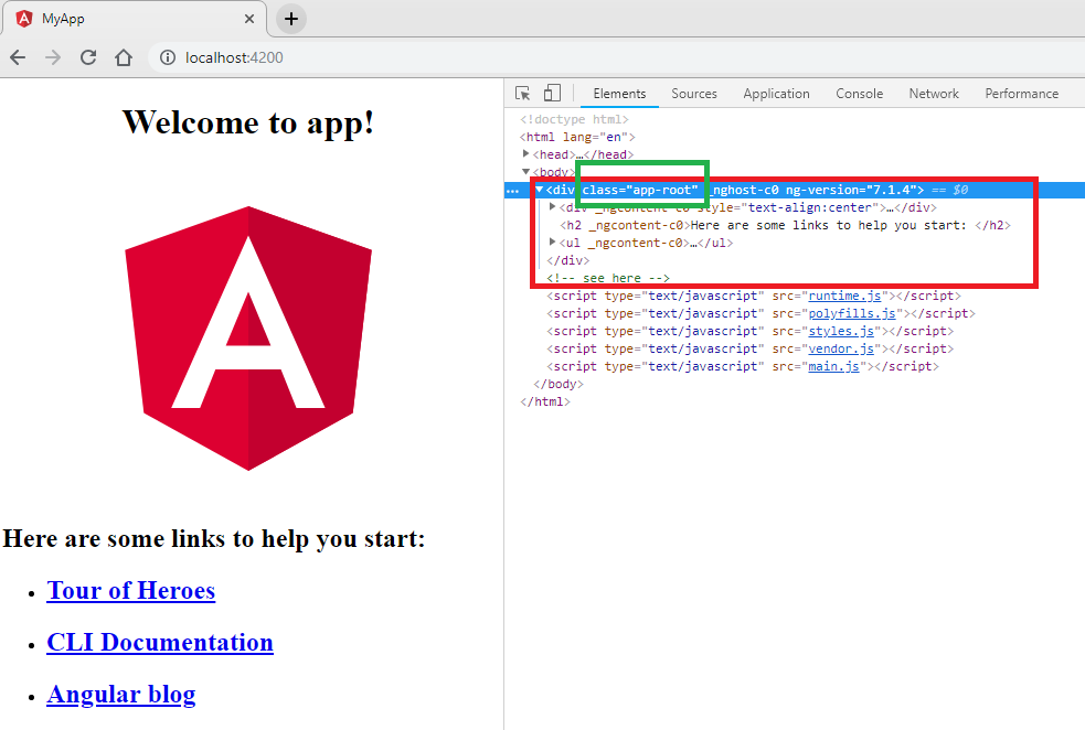
selector: ".app-root" would result in the component used as a CSS class as <div class = "app-root"> </div> in the HTML.
Here we will use Clase name as .app-root selector as shown below
app.component.ts
import { Component } from '@angular/core';

@Component({
  selector: '.app-root', // see here
  templateUrl: './app.component.html',
  styleUrls: ['./app.component.css']
})
export class AppComponent {
  title = 'app';
}
And index.html as shown below
index.html
<!doctype html>
<html lang="en">
<head>
  <meta charset="utf-8">
  <title>MyApp</title>
  <base href="/">

  <meta name="viewport" content="width=device-width, initial-scale=1">
  <link rel="icon" type="image/x-icon" href="favicon.ico">
</head>
<body>
  <div class = "app-root"> </div>
</body>
</html>
When we run our app you will show output as shown below
[attribute]: Select by attribute name
selector: "[app-root]" would result in the component used as an attribute in an existing element such as <div app-root> </div> in index.HTML.
Here we will use Clase name as [app-root] selector as shown below
app.component.ts
import { Component } from '@angular/core';

@Component({
  selector: '[app-root]', // see here
  templateUrl: './app.component.html',
  styleUrls: ['./app.component.css']
})
export class AppComponent {
  title = 'app';
}
And index.html as shown below
index.html
<!doctype html>
<html lang="en">
<head>
  <meta charset="utf-8">
  <title>MyApp</title>
  <base href="/">

  <meta name="viewport" content="width=device-width, initial-scale=1">
  <link rel="icon" type="image/x-icon" href="favicon.ico">
</head>
<body>
  <div app-root </div>
</body>
</html>
When we run our app you will show output as shown below