animations
We know that @Component decorator functions take object, and this object contains a lot of properties. So we will learn about animations properties in this article.
Animation is defined as the transition from start (initial state) to end (final state).it is an important part of any modern web application. The animation not only helps us to create an excellent user interface, but it makes the application interesting and fun to use. A well-structured animation keeps the user attraction to the application and improves the user experience.
Angular allows us to create animations, which gives us performances similar to native ones. In this article, we will learn how we can create animations using Angular 7.
Understanding the states of the angular animation
Animation is a transition from one state to another state of the element. There are three different states for an element in angular.
- Void state: The void state represents the state of an element that is not a part of the DOM. This state occurs when an element is created but not yet inserted in the DOM or the element is removed from the DOM. This state is useful when we want to create animations when we add or delete an element from our DOM. To define this state in our code we use the void keyword.
- The wildcard state: it is also known as the default state of the element. The styles defined for this state apply to the element regardless of its current animation state. To define that state in our code we use the symbol *.
- Custom state: this is the custom state of the element and must be explicitly defined in the code. To define this state in our code, we can use any custom name as our choice.
Time transition animation
To show the animation transition from one state to another, we define the animation transition time in our application.
Angular provides us with the following three timing properties:
- Duration
This property represents the time needed to complete our animation from the start (initial state) to the end (final state). We can categorize the duration of the animation in the following three ways:- Use an integer value, which represents the time in milliseconds, for example 500
- Use a string value to represent the time in milliseconds, for example "500ms"
- Use a string value to represent the time in seconds. for example, "0.5s"
- Delay
This property represents the period of time between the activation of the animation and the beginning of the actual transition. This property also follows the same syntax of duration. To define the delay, we must add the delay value after the duration value in a string format---- "Duration delay". The delay is an optional property, for example ‘0.3s 500ms’. This means the transition will wait 500ms and then it will run for 0.3 seconds. - Easing
This property represents the way in which animation accelerates or decelerates during execution. We can define the easing by adding it as the third variable in the string after the duration and delay. Whenever the delay value is not existing, then easing will be the second value. This is also an optional property. For example:- '0.3s 500ms of ease-in’. This means that the transition will wait 500ms and then executed for 0.3 seconds (300ms) with the easy-in effect.
- '300ms ease-out'. This means that the transition will be performed for 300ms (0.3 s) with the ease-out effect.
Creating the Angular 7 application
Open the command prompt on your computer and run the following set of commands:
- mkdir angularapp
- cd angularProject
- ng new angular7app
These commands will create a directory with the name angularapp and then create an Angular application with the name angular7app inside that directory.
Open the angular7app app using the VS code. Now we create our component.
Navigate to see >> Integrated terminal. it will open a terminal window in VS Code.
Run the following command to create the component
ng g c animationdemo
This will create a component, animationdemo, within the /src/app directory as shown below.
To use angular animation, we need to import BrowserAnimationsModule, which
is a specific animation module in our application. Open the app.module.ts
file and have to include the import definition as shown below:
AppModule
import { BrowserModule } from '@angular/platform-browser';
import { NgModule } from '@angular/core';
import { AppComponent } from './app.component';
import { AnimationdemoComponent } from './animationdemo/animationdemo.component';

import { BrowserAnimationsModule } from '@angular/platform-browser/animations'; //to be import here BrowserAnimationsModule

@NgModule({
  declarations: [
    AppComponent,
    AnimationdemoComponent
  ],
  imports: [
    BrowserModule,
    BrowserAnimationsModule // to be include here BrowserAnimationsModule
  ],
  providers: [],
  bootstrap: [AppComponent]
})
export class AppModule { }
Understanding the syntax of the angular animation
We will write our animation code within the component metadata. The syntax for the animation is as shown below:
animationdemo.component.ts
@Component({
// other component properties.
  animations: [
    trigger('triggerName'), [
      state('stateName', style())
      transition('stateChangeExpression', [Animation Steps])
    ]
  ]
})
Here we will use a property called animations. This property will take an array as input. The array contains one or more "triggers". Every trigger has a unique name and an implementation. The state and transitions of our animation must be defined in the implementation of the trigger.
Each state function has a "stateName" defined to uniquely identify the state and a style function to show the style of an element in that state.
Each transition function has a stateChangeExpression defined to show the change in state of an element and the corresponding array of animation steps to show how the transition will occur. We can include multiple trigger functions within the animation property as values separated by commas.
These functions (trigger, state and transition) are defined in the module @ angular/animations. Therefore, we must import this module into our component.
To apply animation to an element, you must include the name of the trigger in the element definition. Include the name of the trigger followed by the @ symbol in the element tag. See the sample code below:
<div @changeSize></div>
This will apply the changeSize trigger to the <div> element.
Let’s create some animations to better understand the concepts of angular animation.
Change the size of the animation
We will create an animation to change the size of a <div> element at the click of a button.
Open the animationdemo.component.ts file and add the following import definition.
import { trigger, state, style, animate, transition } from '@angular/animations';
Add the following animation property definition code in our component metadata.
animations: [
  trigger('changeDivSize', [
    state('initial', style({
      backgroundColor: 'orange',
      width: '100px',
      height: '100px'
    })),
    state('final', style({
      backgroundColor: 'blue',
      width: '200px',
      height: '200px'
    })),
    transition('initial=>final', animate('1500ms')),
    transition('final=>initial', animate('1000ms'))
  ]),
]
Here we have defined a trigger, changeDivSize and two state functions within the trigger. The element color will be green in the "initial" state and will be red along with an increased width and height in the "final" state.
We have defined the transitions for the change of state. The transition from "initial" to "final" will require 1500ms and from "final" to "initial" it will require 1000ms.
To change the state of our element we will write a function in the class of our component. Just Include the following code in the AnimationdemoComponent class:
currentState = 'initial';
changeState() {
  this.currentState = this.currentState === 'initial' ? 'final' : 'initial';
}
Here we have defined a changeState method that will change the state of the element.
Now the animationdemo.component.ts file shown below:
animationdemo.component.ts
import { Component, OnInit } from '@angular/core';
import { trigger, state, style, animate, transition } from '@angular/animations';

@Component({
  selector: 'app-animationdemo',
  templateUrl: './animationdemo.component.html',
  styleUrls: ['./animationdemo.component.css'],
  animations: [
    trigger('changeDivSize', [
      state('initial', style({
        backgroundColor: 'orange',
        width: '100px',
        height: '100px'
      })),
      state('final', style({
        backgroundColor: 'blue',
        width: '200px',
        height: '200px'
      })),
      transition('initial=>final', animate('1500ms')),
      transition('final=>initial', animate('1000ms'))
    ]),
  ]

})
export class AnimationdemoComponent implements OnInit {
  currentState = 'initial';
  constructor() { }

  ngOnInit() {
  }
  changeState() {
    this.currentState = this.currentState === 'initial' ? 'final' : 'initial';
  }
}
Open the animationdemo.component.html file and add the following code:
animationdemo.component.html
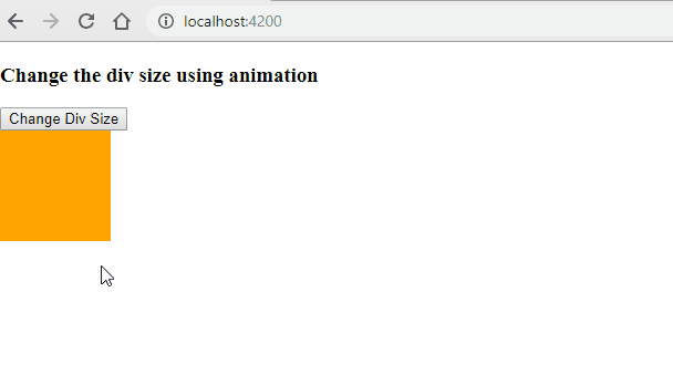
<h3>Change the div size using animation</h3>
<button (click)="changeState()">Change Div Size</button>
<br />
<div [@changeDivSize]=currentState></div>
<br />
We have defined a button that will invoke the changeState function when clicked. We have defined a <div> element and applied the changeDivSize animation trigger. When we click on the button, the state of the <div> element will flip and its size will change with a transition effect.
Before running the application, we must include the reference to our Animationdemo component within the app.component.html file.
app.component.html
<app-animationdemo></app-animationdemo>
To execute the code, execute the command ng serve in the terminal window of the VS code. After executing this command, you will be asked to open http: // localhost: 4200 in your browser. Therefore, open any browser on your computer and navigate to this URL. You can view a web page as shown below. Click on the button to see the animation.
Balloon Effect Animation
In the previous animation, the transition occurred in two directions. In this section, we will learn how to resize from all directions. It will be similar to inflate and deflate a balloon from which the name derives, balloon effect animation.
Add the following trigger definition code in the animation property in our component.
app.component.ts
  animations: [
    trigger('balloonEffect', [
      state('initial', style({
        backgroundColor: 'orange',
        transform: 'scale(1)'
      })),
      state('final', blue({
        backgroundColor: 'red',
        transform: 'scale(1.5)'
      })),
      transition('final=>initial', animate('1000ms')),
      transition('initial=>final', animate('1500ms'))
    ]),
  ]
Here, instead of defining the width and height property, we are using the transformation property to resize from all directions. The transition will occur whenever the stage of the element is changed.
Now the animationdemo.component.ts file shown below:
animationdemo.component.ts
import { Component, OnInit } from '@angular/core';
import { trigger, state, style, animate, transition } from '@angular/animations';

@Component({
  selector: 'app-animationdemo',
  templateUrl: './animationdemo.component.html',
  styleUrls: ['./animationdemo.component.css'],
  animations: [
    trigger('balloonEffect', [
      state('initial', style({
        backgroundColor: 'orange',
        transform: 'scale(1)'
      })),
      state('final', style({
        backgroundColor: 'blue',
        transform: 'scale(1.5)'
      })),
      transition('final=>initial', animate('1000ms')),
      transition('initial=>final', animate('1500ms'))
    ]),
  ]

})
export class AnimationdemoComponent implements OnInit {
  currentState = 'initial';
  constructor() { }

  ngOnInit() {
  }
  changeState() {
    this.currentState = this.currentState === 'initial' ? 'final' : 'initial';
  }
}
Add the following HTML to the app.component.html file.
app.component.html
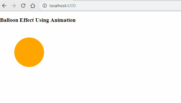
<h3>Balloon Effect Using Animation</h3>
<div (click)="changeState()"
  style="width:100px;height:100px; border-radius: 100%; margin: 3rem; background-color: yellow"
  [@balloonEffect]=currentState>
</div>
Here we have defined a div and we have applied the CSS style to turn it into a circle. When you click on a div, the changeState method will be invoked to change the state of the element.
Open the browser and see the animation in action as shown below:
Fade in and Fade out Animation
Sometimes we want to show an animation when adding or deleting an element in the DOM. We will see how to animate the addition and deletion of an element in a list with the effect of fade-in. and fade-out.
Add the following code inside the AnimationdemoComponent class definition to add and remove the item in a list.
listItem = [];
list_order: number = 1;
addItem() {
  var listitem = "ListItem " + this.list_order;
  this.list_order++;
  this.listItem.push(listitem);
}
removeItem() {
  this.listItem.length -= 1;
}
Add the following trigger definition code in the animation property in our component.
 animations: [
    trigger('fadeInOut', [
      state('void', style({
        opacity: 0
      })),
      transition('void <=> *', animate(1000)),
    ]),
  ]
Now the animationdemo.component.ts file shown below:
animationdemo.component.ts
import { Component, OnInit } from '@angular/core';
import { trigger, state, style, animate, transition } from '@angular/animations';

@Component({
  selector: 'app-animationdemo',
  templateUrl: './animationdemo.component.html',
  styleUrls: ['./animationdemo.component.css'],
  animations: [
    trigger('fadeInOut', [
      state('void', style({
        opacity: 0
      })),
      transition('void <=> *', animate(1000)),
    ]),
  ]

})
export class AnimationdemoComponent implements OnInit {
  listItem = [];
  list_order: number = 1;
  constructor() { }

  ngOnInit() {
  }

  addItem() {
    var listitem = "ListItem " + this.list_order;
    this.list_order++;
    this.listItem.push(listitem);
  }
  removeItem() {
    this.listItem.length -= 1;
  }
}
Here we have defined the fadeInOut trigger. When the element is added to the DOM, it is a transition from a void to a wildcard (*) state. This is denoted using void => *. When the item is removed from the DOM, it is a wildcard transition (*) to a void state. This is denoted using * => void.
When we use the same animation time for both directions of the animation, we use a shorthand syntax, <=>. As defined in this trigger, to complete the animation from void => * and * => void will take 1000ms.
Open the app.component.html file and Add the following HTML code
animationdemo.component.ts
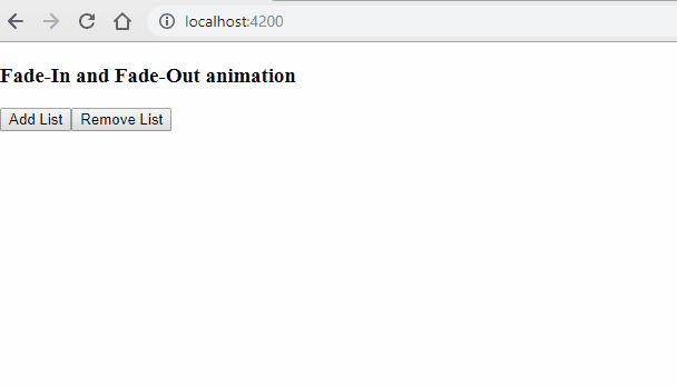
<h3>Fade-In and Fade-Out animation</h3>
<button (click)="addItem()">Add List</button>
<button (click)="removeItem()">Remove List</button>
<div style="width:200px; margin-left: 20px">
  <ul>
    <li *ngFor="let list of listItem" [@fadeInOut]>
      {{list}}
    </li>
  </ul>
</div>
Here we are adding two buttons to add and remove an item. We are binding the fadeInOut trigger to the
Open the browser and look the animation in action as shown below:
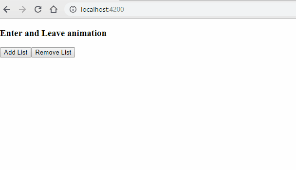
Enter and Leave Animation
As it is added to the DOM, the element will enter the screen from the left and when the item is removed, it will leave the screen from the right.
The transition from void => * and * => void is very common. Therefore, Angular provides aliases for these animations.
- for void => * we can use ':enter'
- for * => void we can use ':leave'
Aliases make transitions more readable and easier to understand.
Add the following trigger definition code in the animation property in our component.
animations: [
    trigger('EnterLeave', [
      state('flyIn', style({ transform: 'translateX(0)' })),
      transition(':enter', [
        style({ transform: 'translateX(-100%)' }),
        animate('0.5s 300ms ease-in')
      ]),
      transition(':leave', [
        animate('0.3s ease-out', style({ transform: 'translateX(100%)' }))
      ])
    ])
 ]
Now the animationdemo.component.ts file shown below:
animationdemo.component.ts
import { Component, OnInit } from '@angular/core';
import { trigger, state, style, animate, transition } from '@angular/animations';

@Component({
  selector: 'app-animationdemo',
  templateUrl: './animationdemo.component.html',
  styleUrls: ['./animationdemo.component.css'],
  animations: [
    trigger('EnterLeave', [
      state('flyIn', style({ transform: 'translateX(0)' })),
      transition(':enter', [
        style({ transform: 'translateX(-100%)' }),
        animate('0.5s 300ms ease-in')
      ]),
      transition(':leave', [
        animate('0.3s ease-out', style({ transform: 'translateX(100%)' }))
      ])
    ])
  ]

})
export class AnimationdemoComponent implements OnInit {
  listItem = [];
  list_order: number = 1;
  constructor() { }

  ngOnInit() {
  }

  addItem() {
    var listitem = "ListItem " + this.list_order;
    this.list_order++;
    this.listItem.push(listitem);
  }
  removeItem() {
    this.listItem.length -= 1;
  }

}
Here we have defined the trigger EnterLeave. The transition ': enter' will wait for 300ms and then it will be executed for 0.5 seconds with an ease-in effect. While the transition ': leave' will be performed for 0.3 s with an ease-out effect.
animationdemo.component.ts
<h3>Enter and Leave animation</h3>
<button (click)="addItem()">Add List</button>
<button (click)="removeItem()">Remove List</button>
<div style="width:200px; margin-left: 20px">
  <ul>
    <li *ngFor="let list of listItem" [@EnterLeave]="'flyIn'">
      {{list}}
    </li>
  </ul>
</div>
Here we are defining two buttons to add and remove an item from the list. We are binding EnterLeavetrigger to the
Open the browser and see the animation in action as shown below: